Brand assets
Use these files when you write about us, list us as a partner, or link to our work.
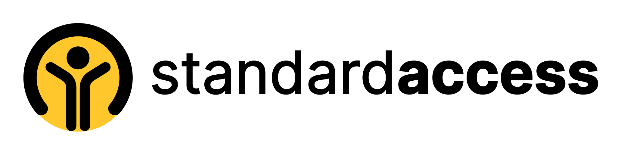
Logo
Choose the version made for your background. Every file includes the clear space it needs.
Full-color logo
For white and light backgrounds. Use this version whenever you can.

Reversed logo
For black and other dark backgrounds.
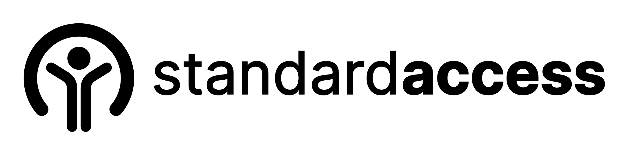
One-color ink logo
For one-color printing, or where yellow would clash with nearby colors.

One-color white logo
For photos with a solid dark area, and dark backgrounds where yellow would clash.
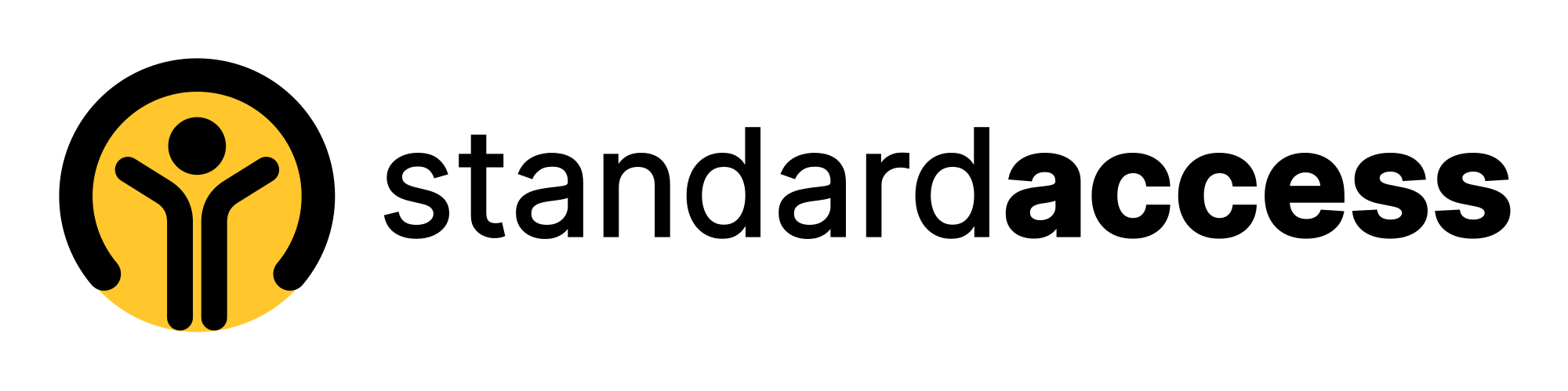


Mark and app icon
Use the mark alone only where the full logo won’t fit, such as a profile picture or a browser tab.

Full-color mark
For avatars and small spaces on light backgrounds.



App icon
For social profiles, bookmarks, and home screens. The file is square; platforms round the corners.






Using the logo
Do not change the files, combine them with another logo, or use them in a way that suggests we endorse a product. If you need another format or aren’t sure about a use, contact us.
Clear space
Leave space at least as wide as the figure’s head on every side. The dashed line shows that boundary. Our files already include it.
Minimum size
Show the logo at least 120 pixels wide on screen, shown here at actual size. Below that, use the mark, at least 24 pixels tall.
Give the logo a text alternative
People who use screen readers hear the alternative text instead of seeing the image. Use our name, “Standard Access”. If the logo links to our website, the name also tells them where the link goes.
<img src="standard-access-logo.svg" alt="Standard Access">Keep it recognizable
Do: Use the files as supplied.
Do: Use the reversed logo on dark backgrounds.
Do not: Stretch or squash the logo.
Do not: Change its colors.
Do not: Rotate it or add shadows and outlines.
Do not: Place it where parts of it fade into the background.
Color
Our colors and what each one is for.
Brand yellow
#FFC72C
The logo, a page’s closing panel, and a highlighter behind black text. It is too light to be text, a line, or an icon on a light background.
Black
#000000
Buttons, links, and the logo.
Ink
#1A1A1A
Body text.
Ground
#FAFAFA
The one background our pages use, from top to bottom.
White
#FFFFFF
Windows and cards, each with one thin line around it.
Night
#111111
Behind the reversed logo, where a surface is already dark. Our pages stay light, so they don’t use it as a background.
Type and shape
One typeface on every device, and small corners with one thin line.
Typeface
Atkinson Hyperlegible Next, on every device. It was made for the Braille Institute to be easier to read with low vision. Headings use weight 450.
Code
Atkinson Hyperlegible Mono, for code and for the roles in a page’s structure. All other text uses the main typeface.
Corners
Buttons and chips are pills. Windows, cards, and panels have 12-pixel corners and one thin line, with no shadow.